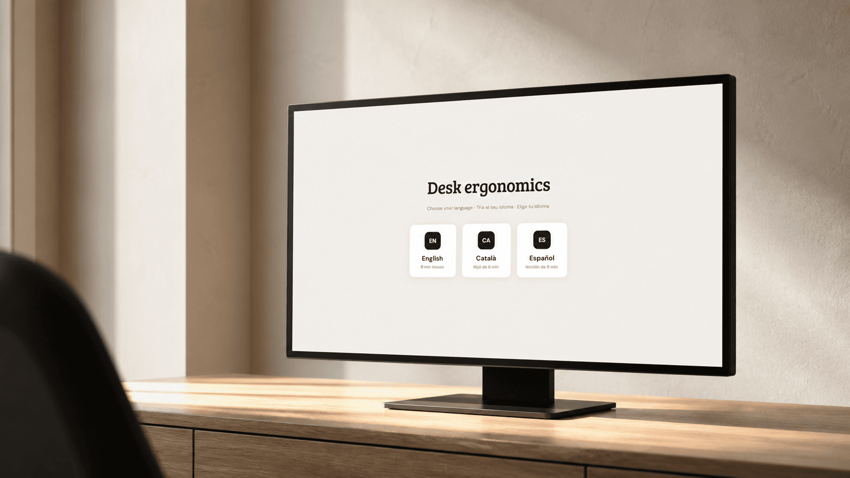
Autistic Camouflaging
A 25-minute bilingual learning experience about the invisible work of masking — and how to loosen it safely.
ROLE
Learning designer & front-end developer
RESPONSIBILITIES
Research, instructional strategy, bilingual writing, visual direction, interaction design, accessibility, front-end development and functional testing
TOOLS USED
Claude · Midjourney · Fliki
overview
Looking Fine Is Work is a bilingual learning experience about autistic camouflaging: the strategies people use to mask, compensate and assimilate; the cost of sustaining them; why women and other overlooked adults are often identified late; and how unmasking can be approached as a contextual, protected choice rather than a demand for total disclosure.
the problem
Autistic camouflaging is often described from the outside as a list of social behaviours. That misses the invisible work: monitoring the body, rehearsing responses, suppressing movement, copying others and recovering afterwards. The same invisibility can delay identification—particularly for women and people whose traits are read through gendered expectations—and can make autistic burnout look like depression or personal failure.
The design challenge was to explain that complexity without pathologising the learner, romanticising unmasking or implying that safety should be traded for authenticity.
the solution
The course makes camouflaging visible through concrete examples, sorting activities and contextual decisions. Learners distinguish masking, compensation and assimilation; compare burnout with depression; explore why identification is often late; and practise choosing where, when and how to loosen a strategy.
Unmasking is framed as a protected experiment: sufficiently safe, reversible and specific. The course saves progress locally, supports English and Spanish, and ends with a complete review of what the learner understood, what needs another look and the practical plan they created.
My Process
The experience was structured as recognition before change. Each section first names what may already be happening, then lets the learner test a distinction, and only afterwards introduces a possible experiment. The result is six sections, four embedded videos, 23 images and five interaction patterns that move from observation to a three-step personal plan.
01
Action Map

The outcome is traced to three failures in the usual conversation: strategies are hard to name, burnout is misread, and unmasking is treated as all-or-nothing. Each is answered with a specific learning interaction.
02
Storyboard
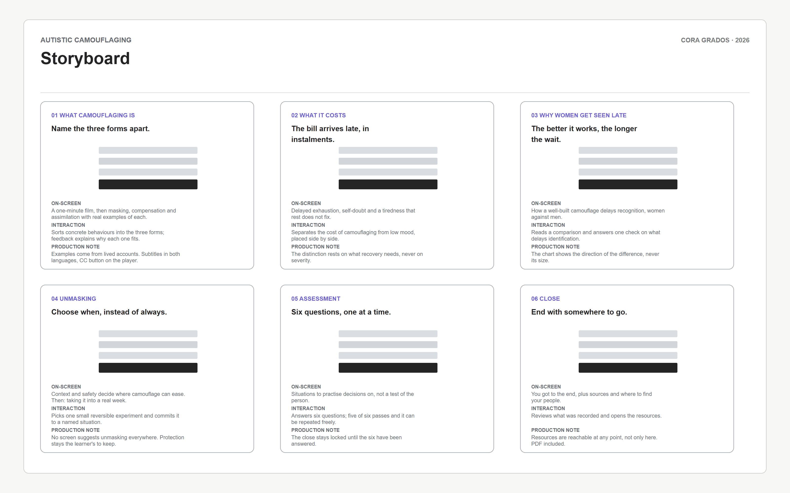
The learner moves from choosing a language to recognising strategies, sorting examples, reading the cost, testing context and recording one protected change. Feedback changes the next prompt, never the learner’s worth.
03
Style Guide
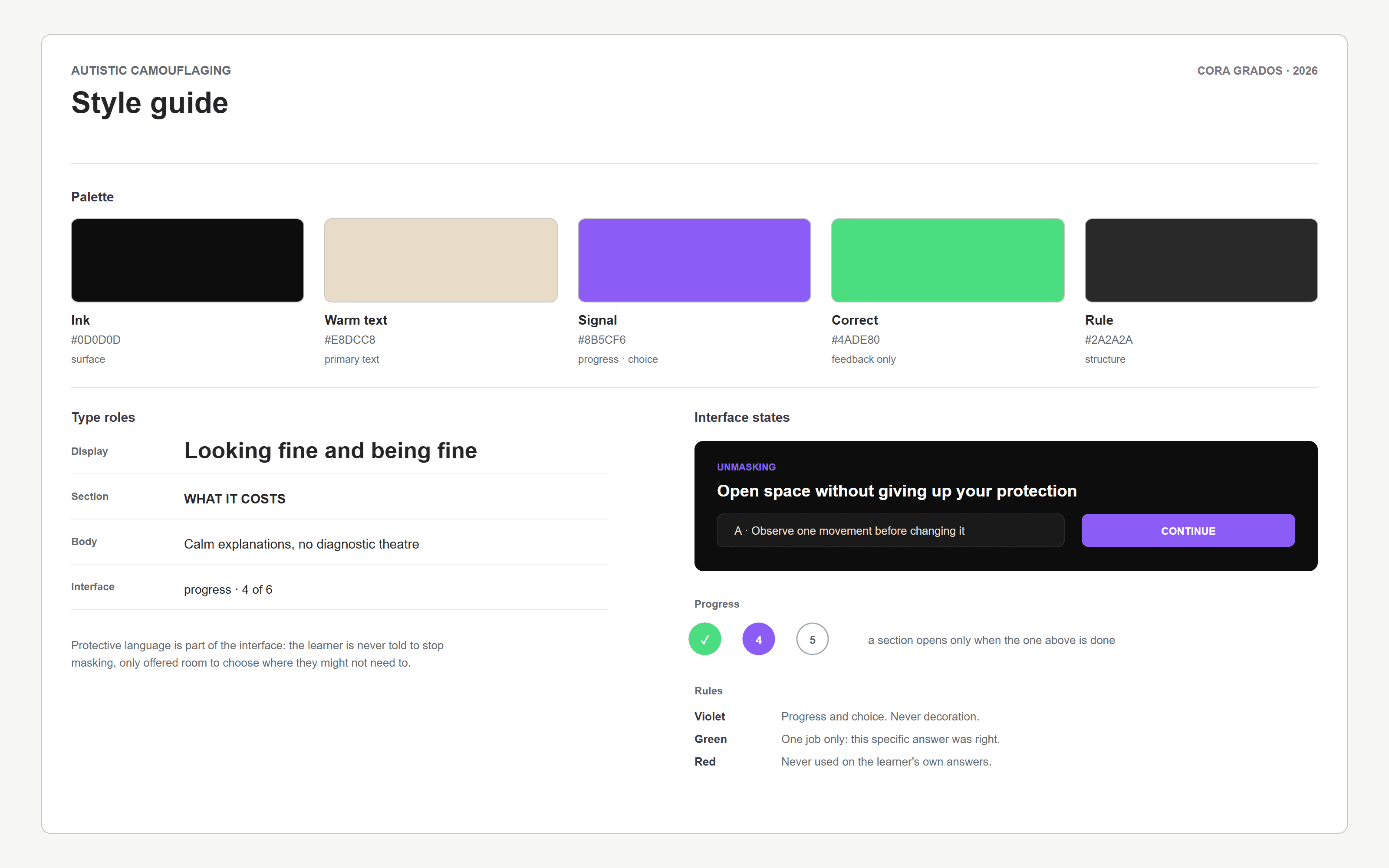
A restrained dark editorial system keeps attention on the topic. Warm text softens the clinical edge, violet signals progress and choice, and green is reserved for specific corrective feedback.
04
Wireframes
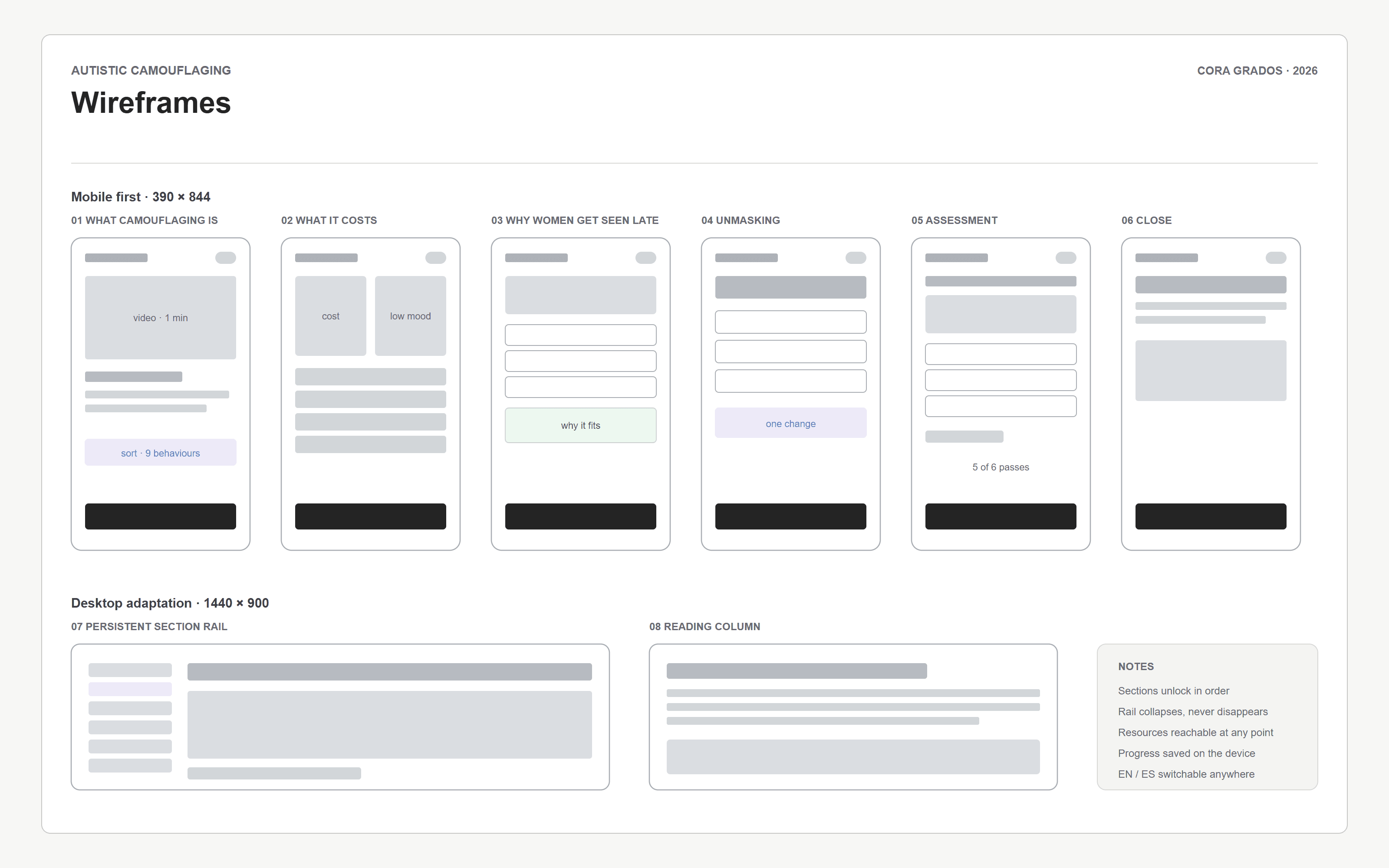
Desktop uses a persistent six-part course map; phone collapses navigation into one reading column. The story order, feedback and recovery cues remain identical across breakpoints.
05
Development

Built by hand as a bilingual single-file course. Media is embedded for offline delivery, video is converted to Blob URLs for reliable iOS seeking, and localStorage restores language, section, responses, results and the final practical plan without requiring an account.
06
Evaluation Plan
Evaluation combined content review with scenario-based functional testing across all six sections and both responsive targets. Every task was completed by keyboard and touch routes; captions, language switching, resume behaviour and final review were checked against fresh and partially completed states.
The most important test was conceptual: incorrect feedback had to clarify a distinction without turning the learner into the problem. That rule shaped every explanation and retry state.
results
The result is a complete 25-minute course in English and Spanish with six sections, four videos, 23 images and a continuous saved state. Learners can resume where they stopped and finish with a transparent review of correct answers, missed distinctions and the personal experiment they planned.
Takeaways
For sensitive health-adjacent learning, tone is part of the interaction design. A technically correct explanation can still cause harm if it frames protection as failure. Starting with recognition, preserving context and making change reversible produced a course that teaches without demanding disclosure.